The Glow Up Is Real
The idea
Most spray tan brands lean into the same handful of clichés — bright orange, beachy, salon-generic. This one skips all of that, built around the idea of a glow rather than a tan, treating the whole experience as something closer to a beauty ritual than a quick service.
The design
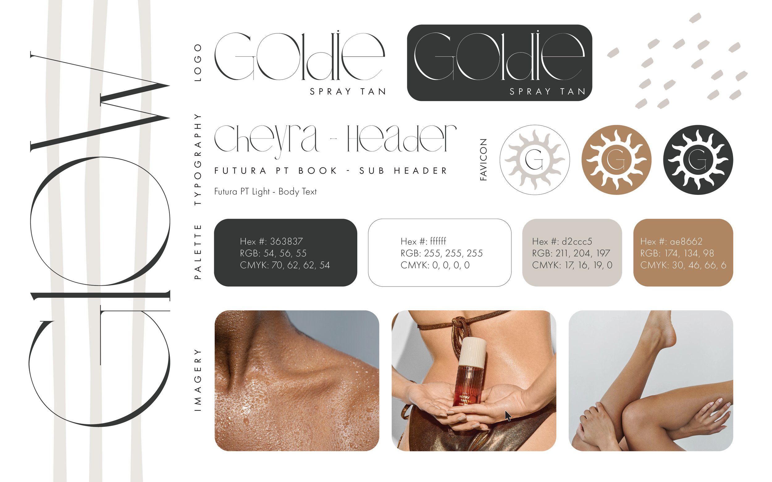
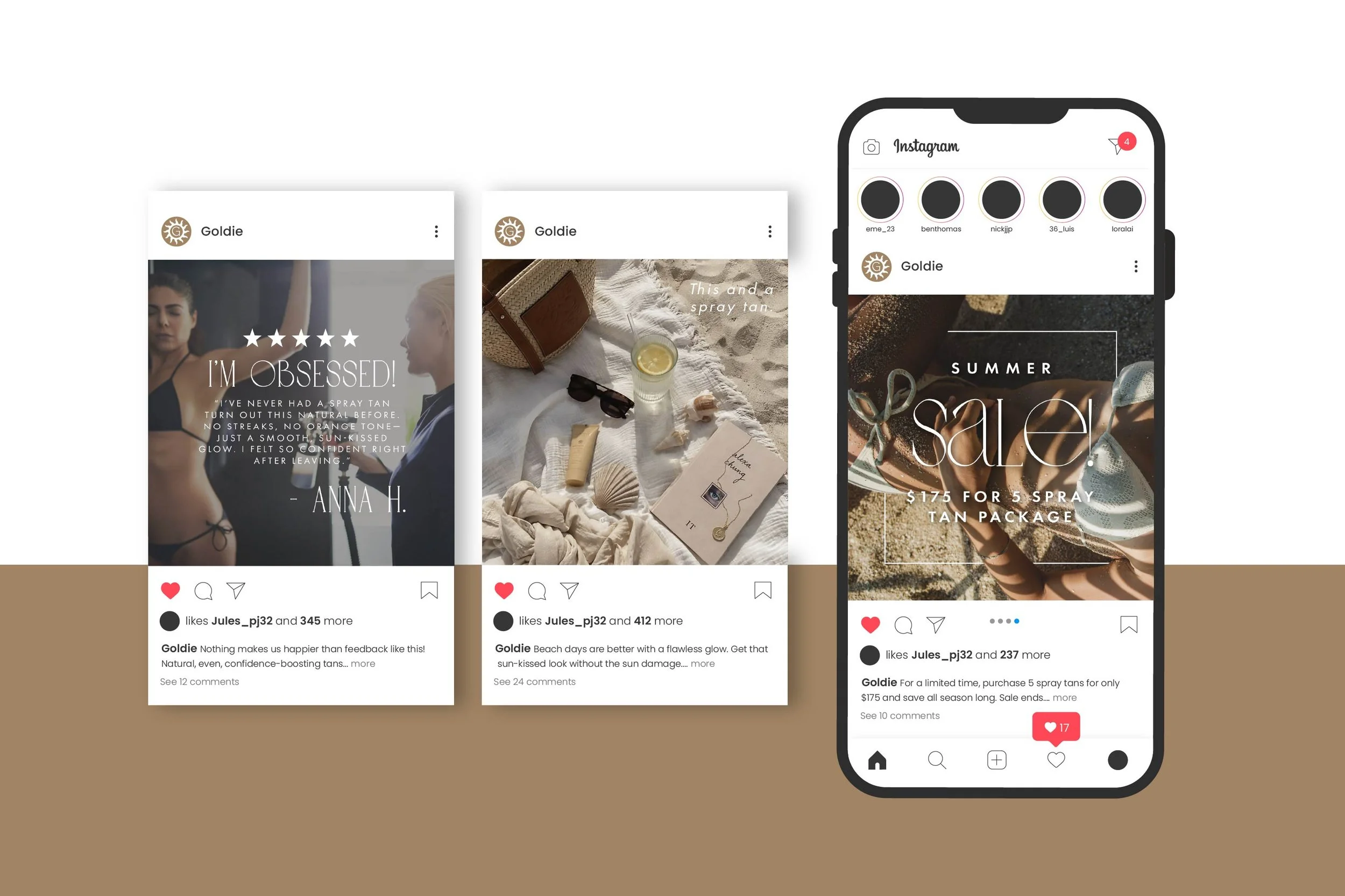
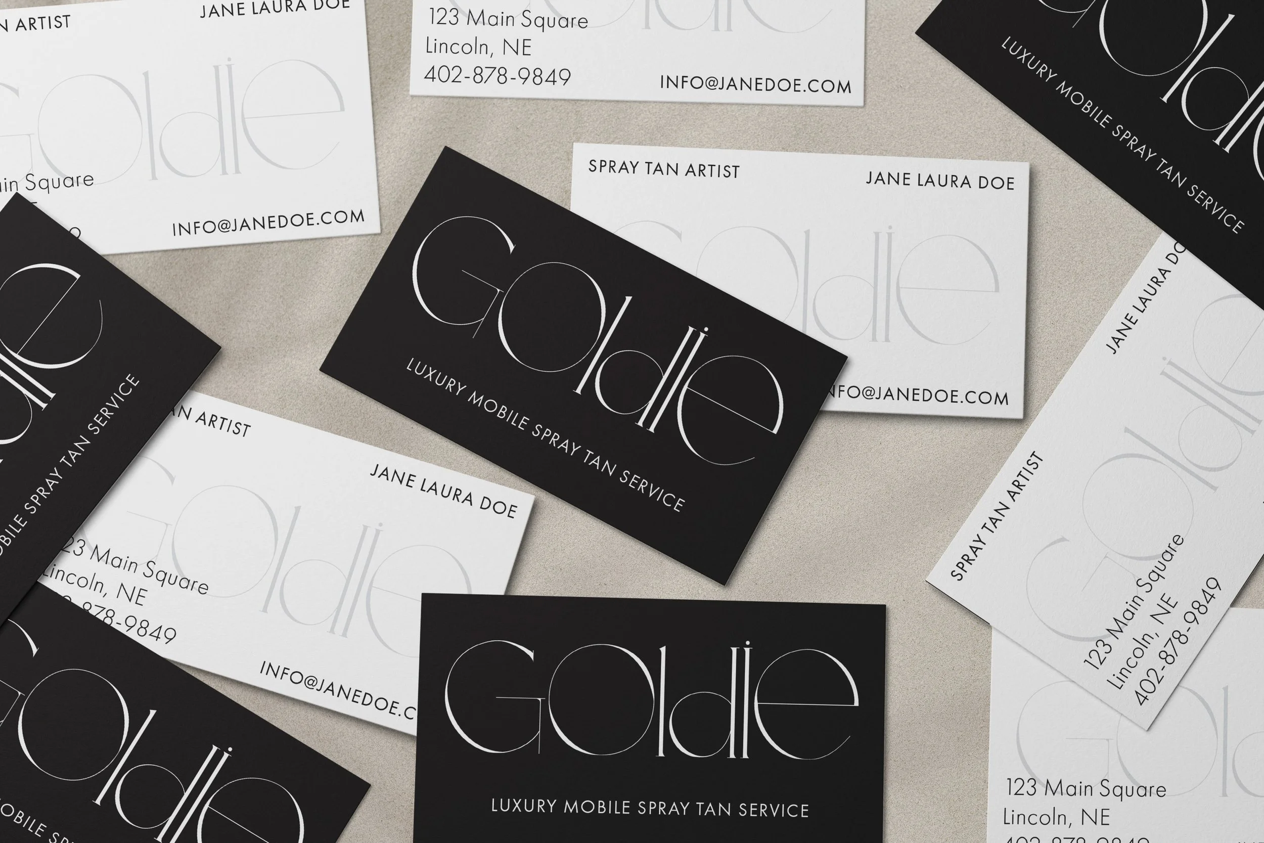
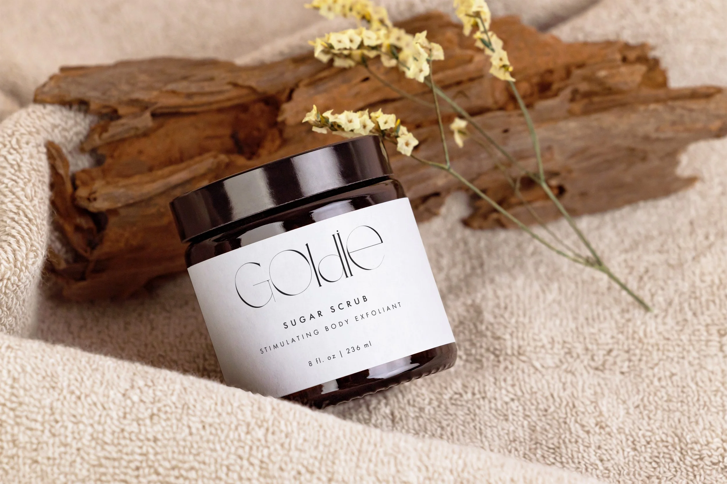
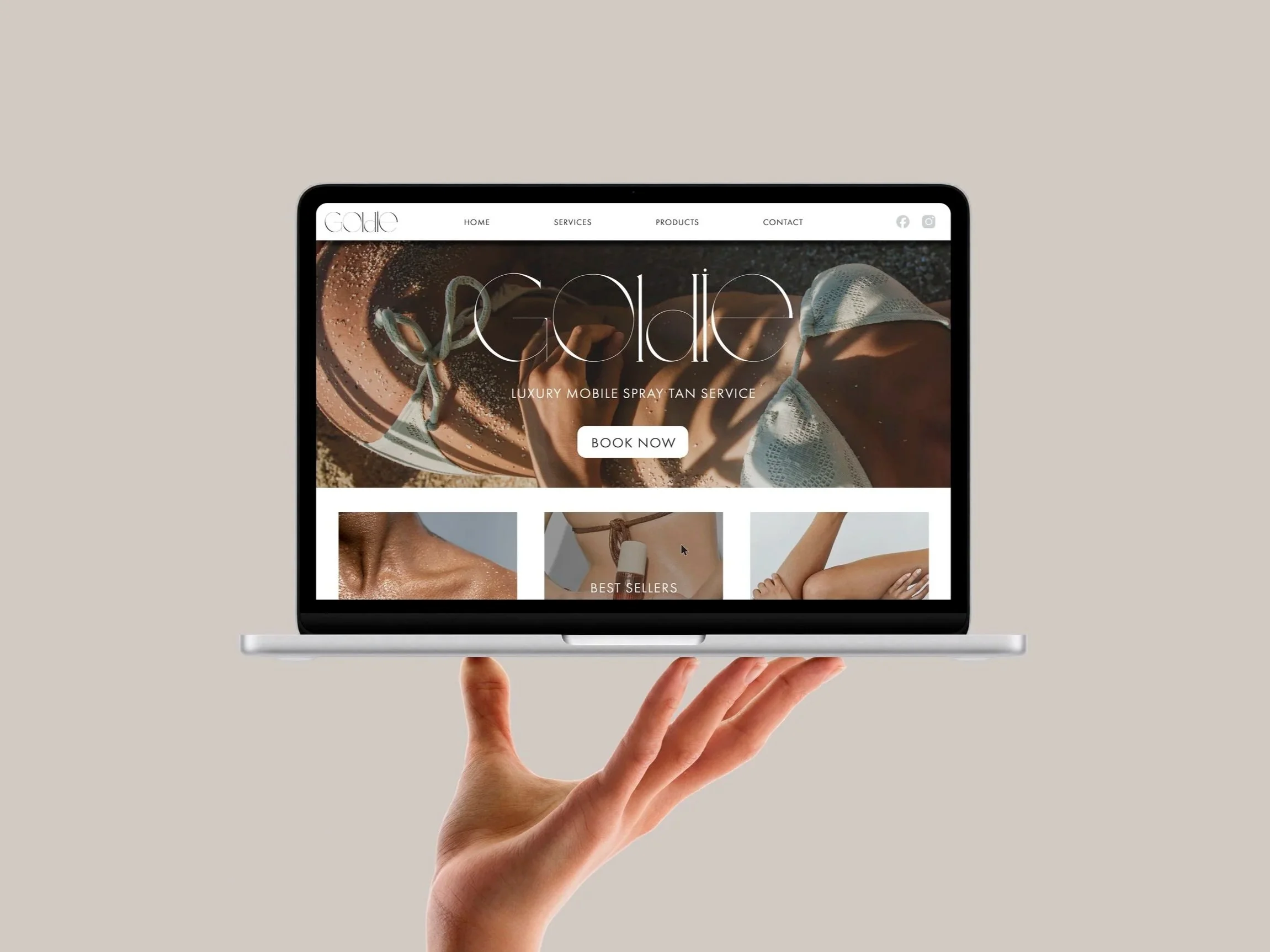
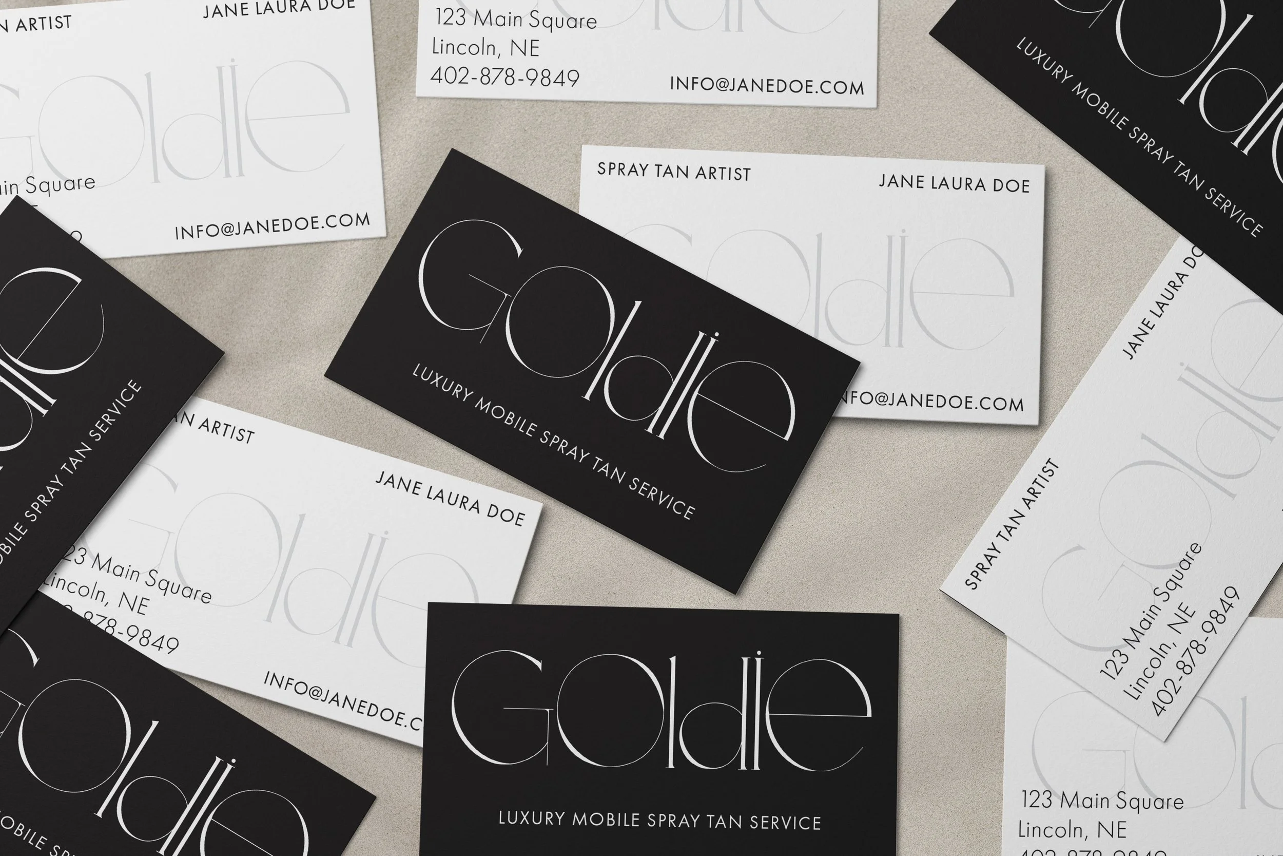
Bronze and tan tones carry most of the warmth, while a clean black-and-white wordmark keeps things from tipping too soft or too beachy. The Goldie logo does a lot of the heavy lifting on its own — tall, editorial, a little unexpected for the category — and it holds up whether it's small on a jar label or blown up on a website hero. Photography leans into skin and texture instead of posed beauty shots, and packaging, web, social, and business cards all pull from the same narrow palette so every touchpoint feels like it belongs together.
The takeaway
The whole idea was never really about the tan, it's about walking away feeling a little more glowy, a little more confident, still completely yourself.