Worth The Detour
The idea
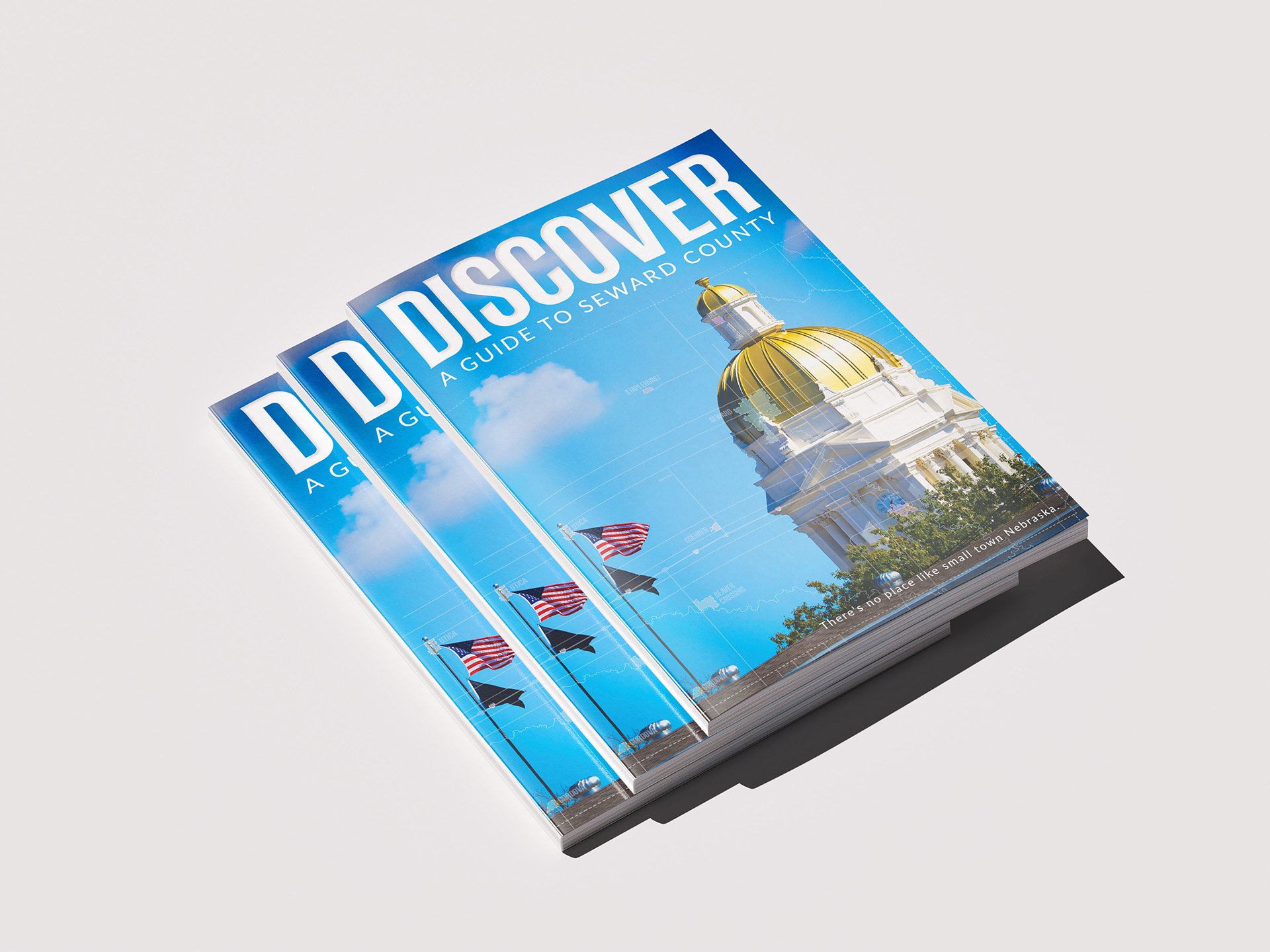
Most visitor guides read like a phone book with a cover slapped on. Discover Seward County was built to do the opposite — make someone unfamiliar with the area actually want to go explore it. The guide is aimed at people just passing through as much as locals, so it had to work as both an easy reference and a reason to stop the car.
The design
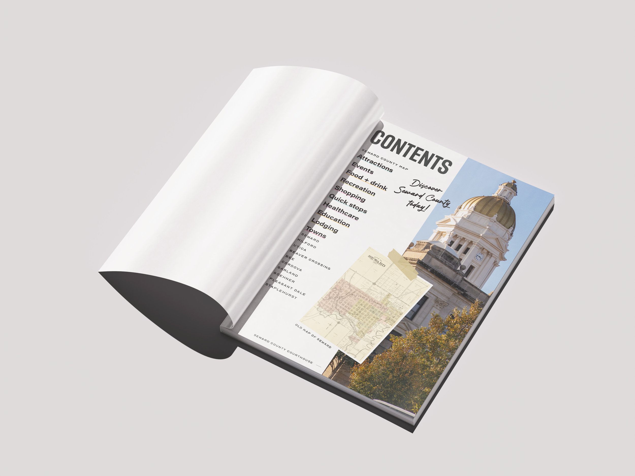
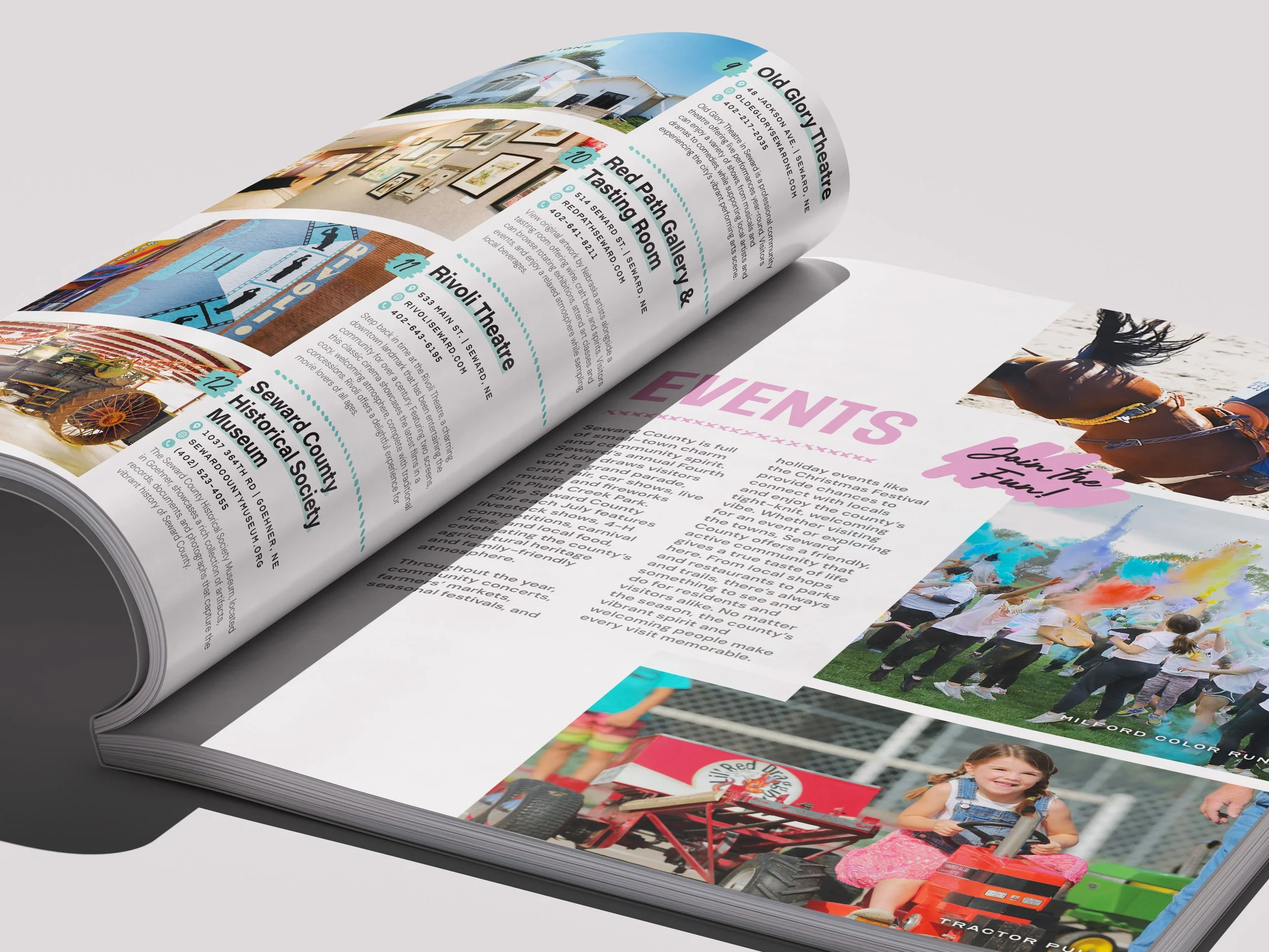
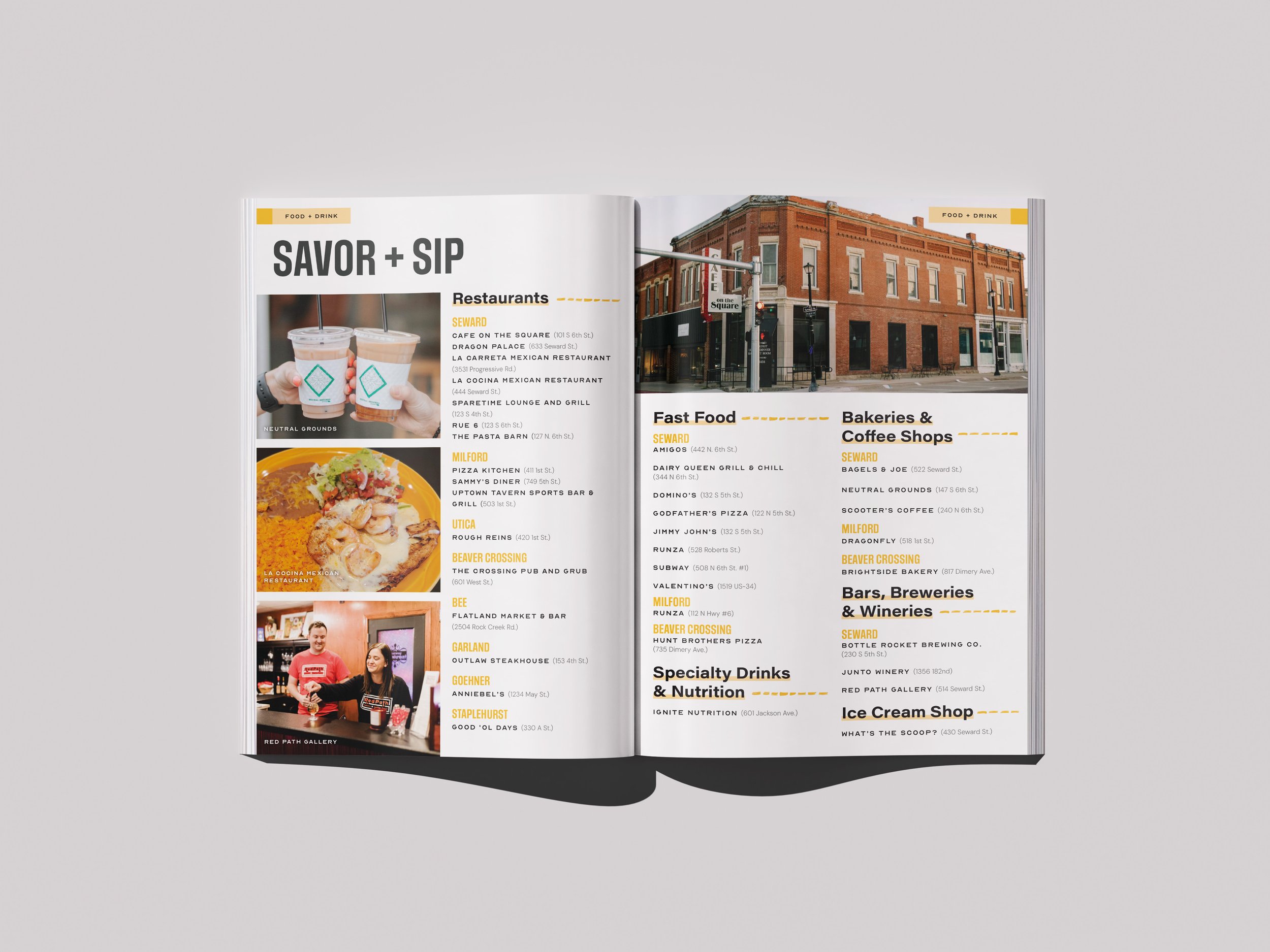
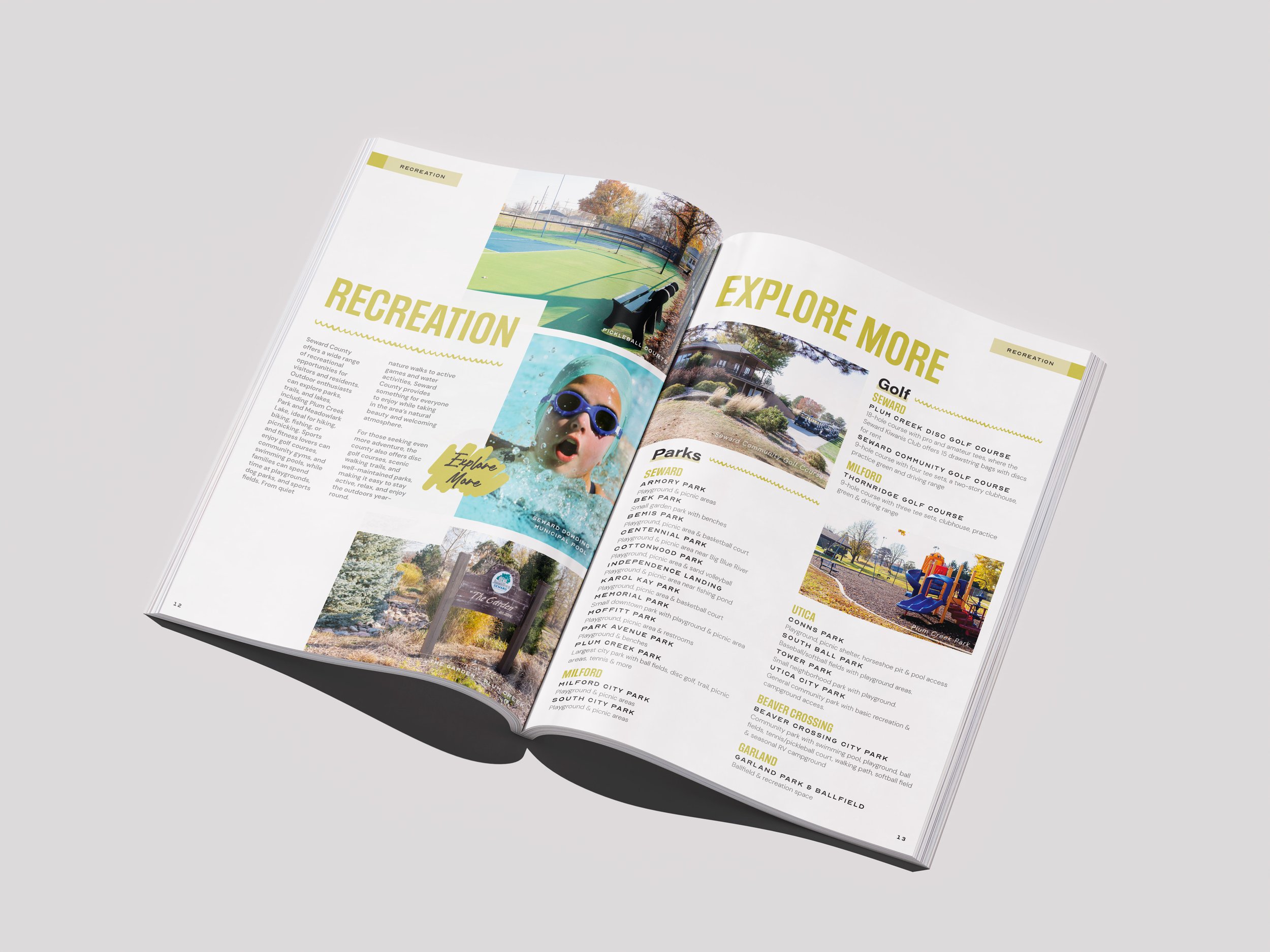
Bright, warm colors — teal, pink, mustard yellow, orange — keep the whole thing feeling energetic instead of like a municipal brochure. Every section (Attractions, Events, Food + Drink, Recreation) gets its own accent color and icon system, so the guide is easy to flip through and find exactly what you need. Real photography of real people at real events does most of the persuading — color runs, farmers markets, local restaurants — so a reader can picture themselves actually there instead of looking at stock imagery. Hand-drawn touches like the torn-paper stickers and the "Discover Seward County Today!" script keep it feeling personal and local rather than corporate.
The takeaway
A visitor guide's only real job is to get someone off the highway and into town. This one earns that by making Seward County look like somewhere worth the stop.