Sip.
shuffle.
stay awhile.
The idea
The name comes from cards (draw two) so that became the whole starting point. Instead of slapping a poker theme on top, the goal was to build a bar identity around the actual ritual of playing: shuffling, dealing, pulling up a chair with people you like.
The design
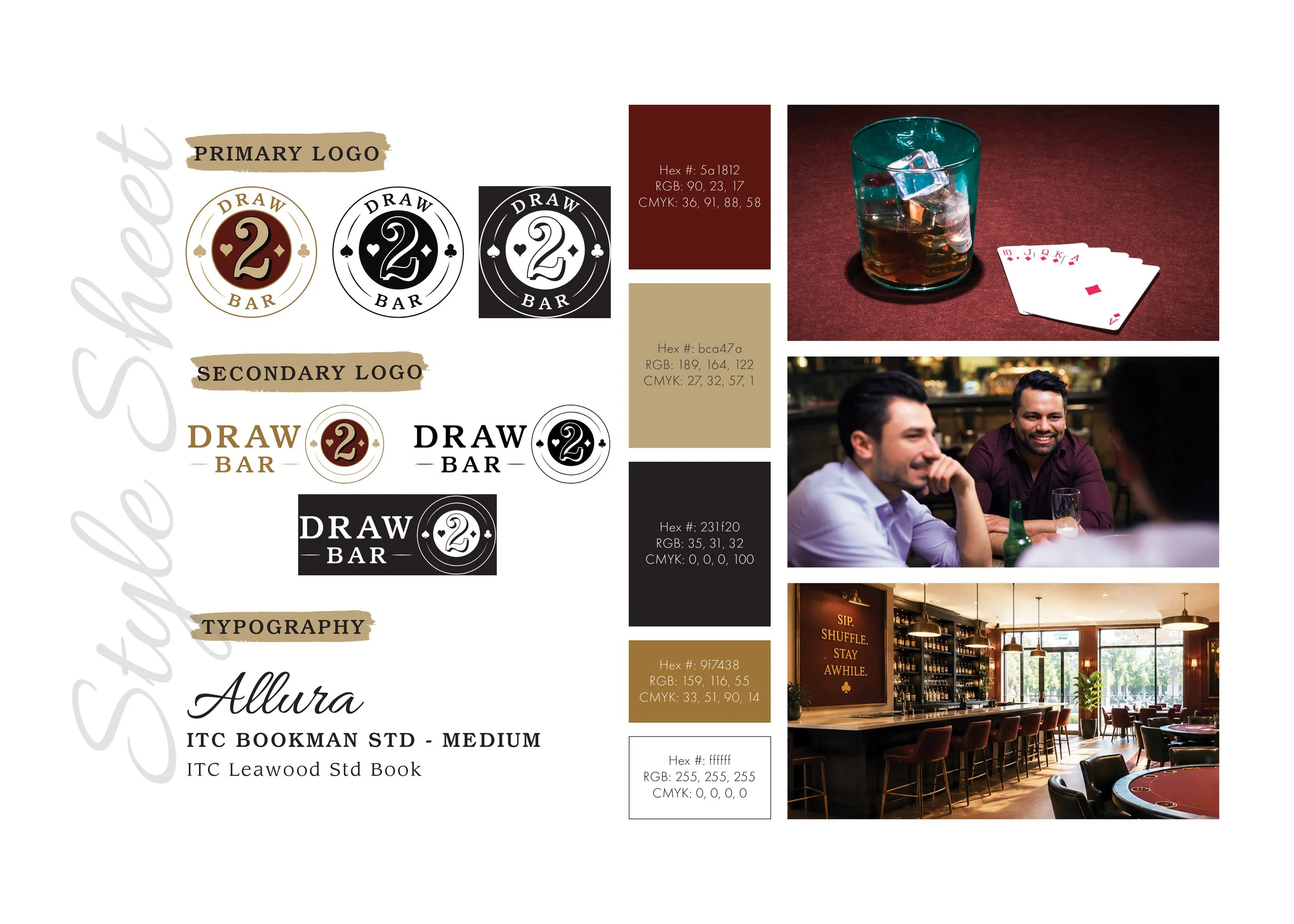
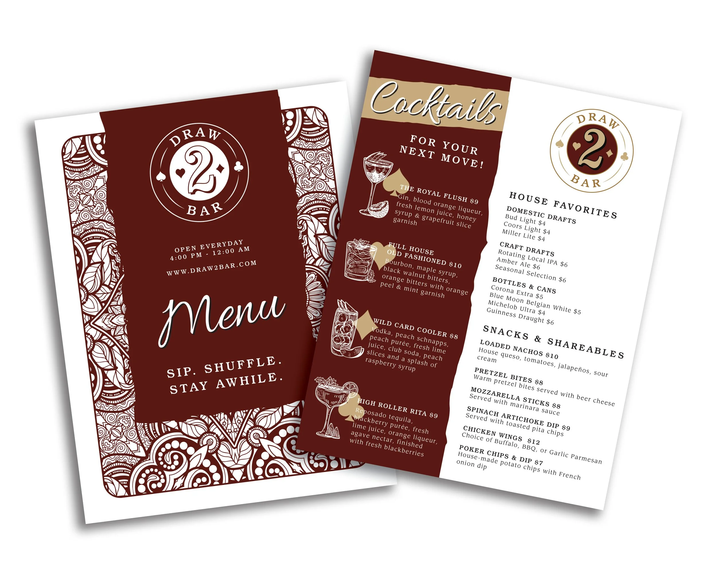
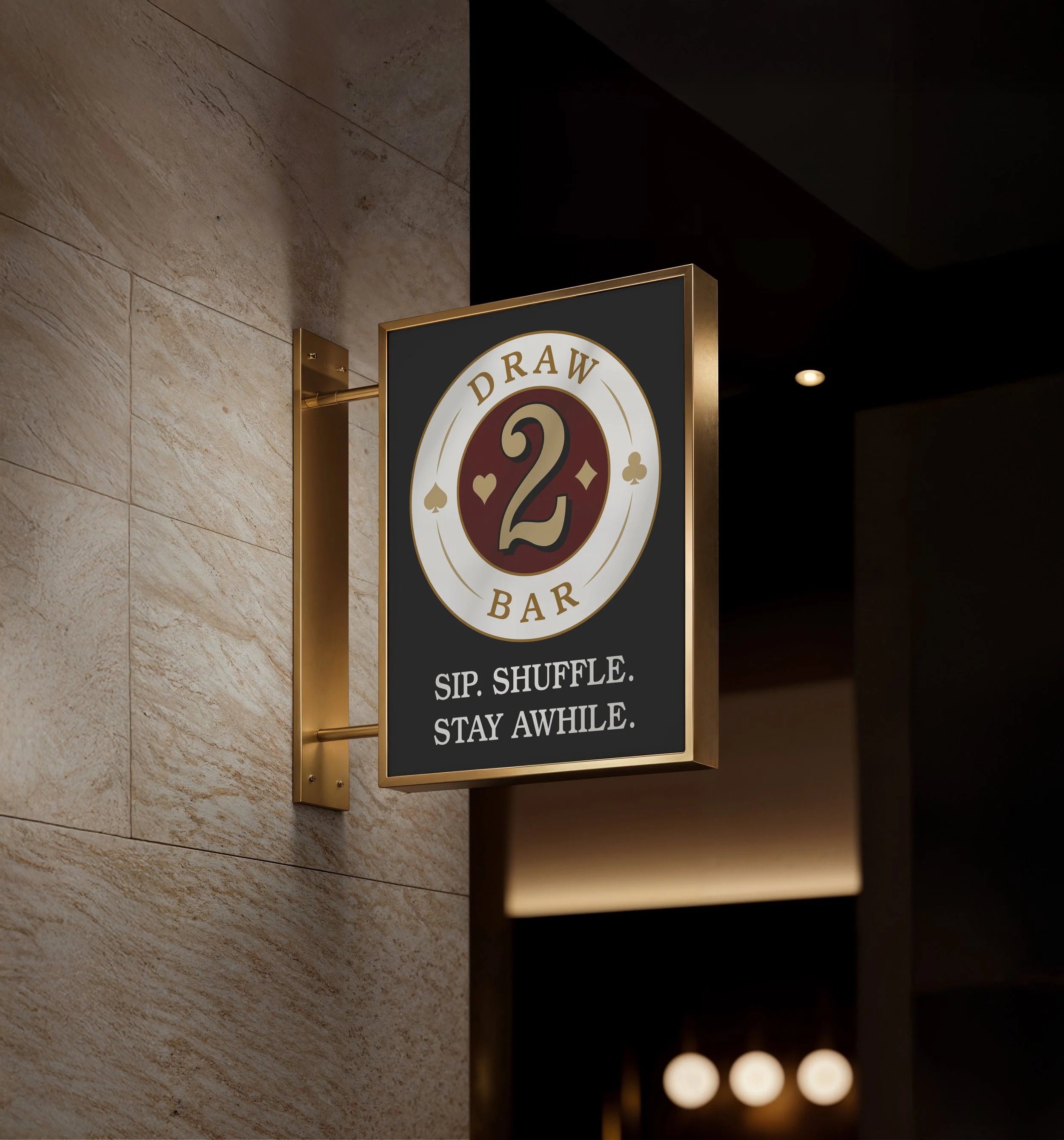
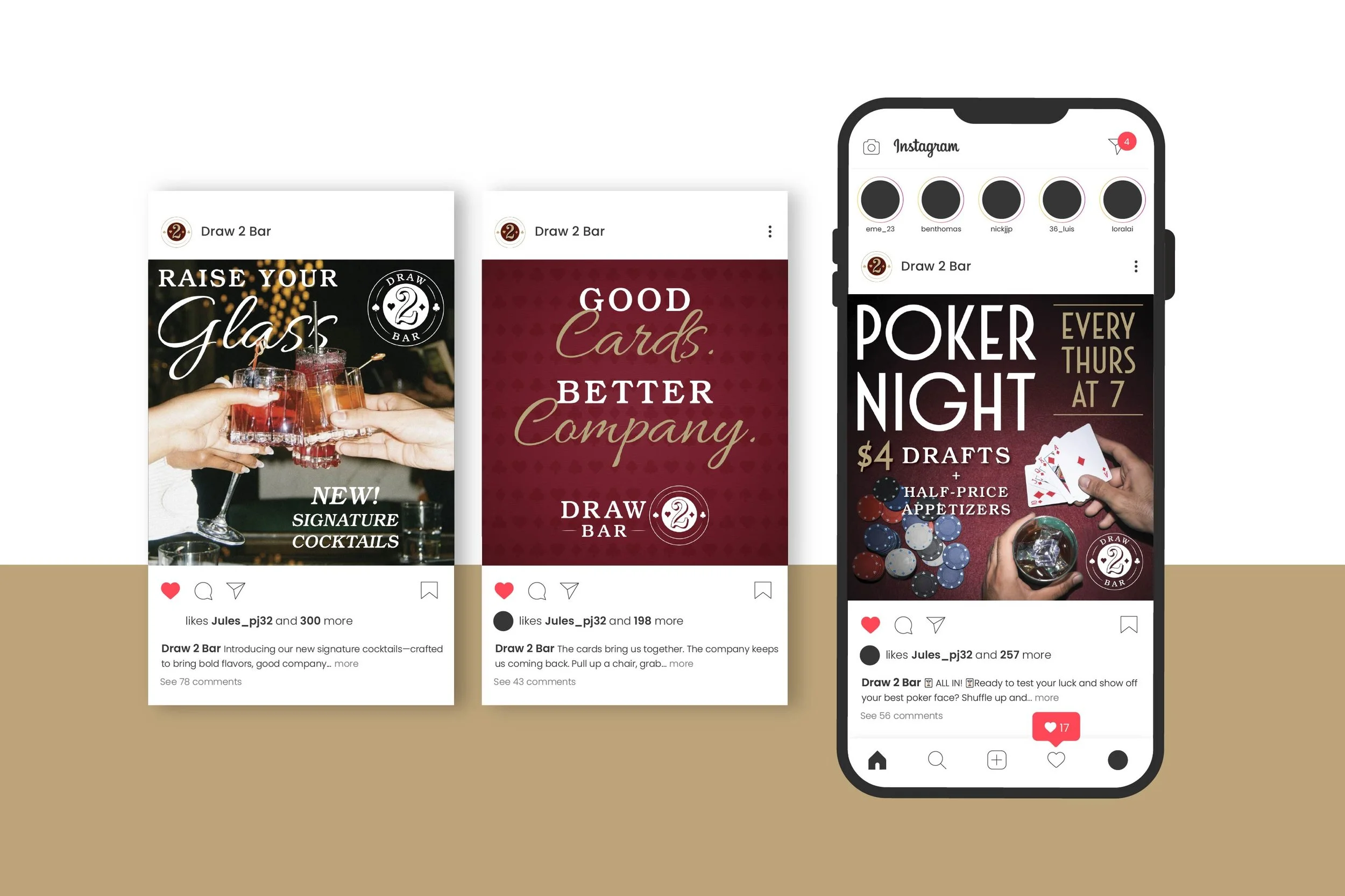
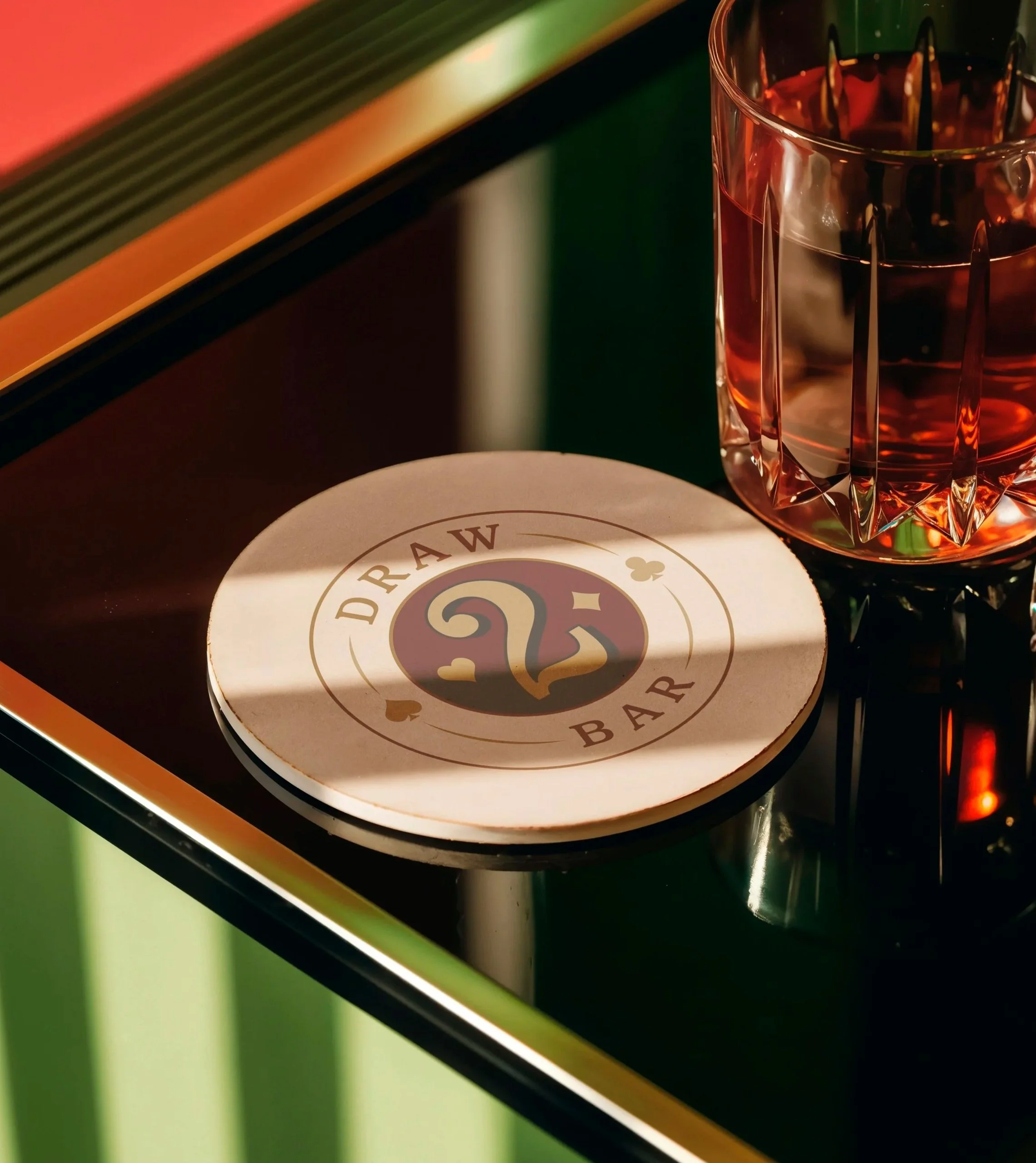
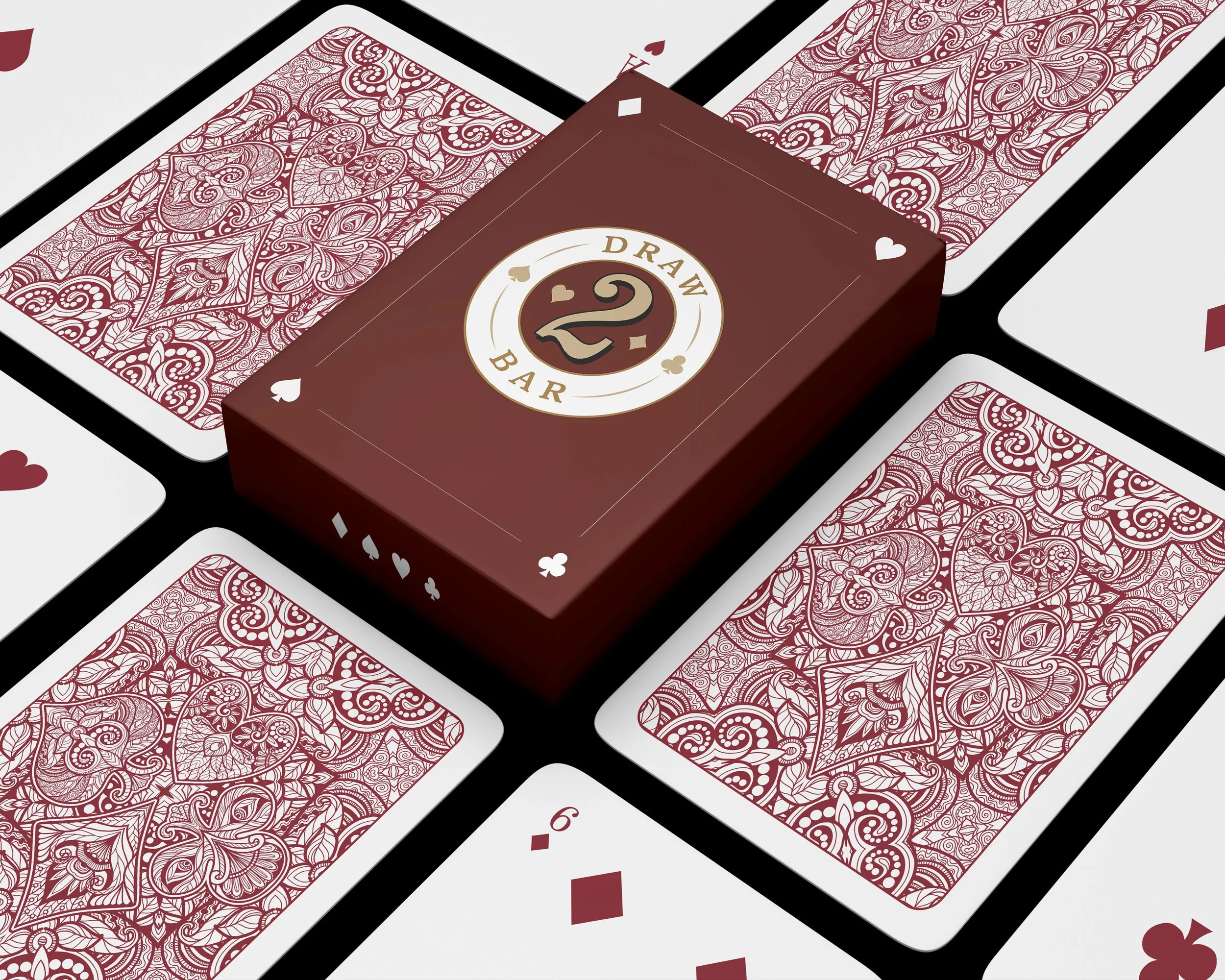
That idea shapes every piece. Burgundy, gold, and black keep things feeling like a lounge instead of a generic sports bar. Even the logo has range — a primary badge mark and a secondary wordmark — but both are always unmistakably the same brand. The card packaging leans furthest into the concept, with paisley suit patterns and a gold-foil-style badge. The menu carries the same palette into cocktail names that play off the theme, and social picks up the same colors and voice for a real content calendar.
The takeaway
Pull any one piece out — the menu, the cards, a single post — and it still feels like Draw 2 Bar. That's the whole test of a brand system holding together.